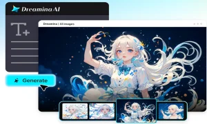
A single campaign rarely needs just one poster. You might need a tall version for stories, a wide version for banners, and a square version for feeds. Resizing the same design often leaves awkward gaps, squeezed text, or tiny print nobody can read. Dreamina’s latest and most advanced image generation model, Seedream 5.5, helps you create vertical and horizontal posters from the same copy, with layouts that adapt instead of simply stretching.
This guide explains how multi-frame typesetting works in Dreamina, how to write copy that travels well between formats, and how to check small print before you publish.
Why one design needs more than one shape
Different platforms use different frames. A tall poster suits stories and print, while a wide layout suits banners and screens. A square one fits many feeds.
If you simply stretch or crop one design, you may lose text or crowd the image. A better approach is to rebuild the layout for each frame while keeping the copy and style the same. Dreamina’s Seedream 5.5 is designed for that kind of adaptation.
Meet Seedream 5.5, Dreamina’s most advanced image generation model
Seedream 5.5 is the model behind Dreamina’s newest image tools. It handles layout, text, and style together. Its main highlights include:
- RGBA transparent layered generation for reusable assets
- Precise editing of specified areas
- Complex information design with accurate text and sensible layouts
- Improved portrait realism
- Intelligent lighting with movie-style presets
For poster work, complex content generation is the key feature. The manual describes accurate text in complex scenes, reasonable structure, and canvas layout and color scheme optimization.
What small print and multi-frame typesetting mean
Small print is the fine text on a poster, such as taglines, credits, and notes. Multi-frame typesetting means organizing the same copy into several frame sizes.
The manual’s demo shows the same set of copywriting arranged in vertical and horizontal versions. It highlights font size, layout, color, and frame size adaptation, and it stresses that the result is not just stretching and cropping. Each frame gets its own composition.
Three concept posters to learn from
The manual presents three concept examples, each with a different mood:
- GRAVITY OFF: technology fashion in English, with cobalt blue, coral orange, liquid shoes, and large edited-style fonts
- MAKE SOME NOISE: music culture with bilingual text, fluorescent green, tomato red, bold lettering, and purple headphones
- AFTER HOURS: an art exhibition with bilingual text, black, white, and red, slender serif characters, and glass butterflies
These are concept activities with no real dates or prices, which makes them safe templates for practice.
Create adaptive posters in 3 fun steps with Dreamina
Step 1: Open Dreamina and write detailed text prompts
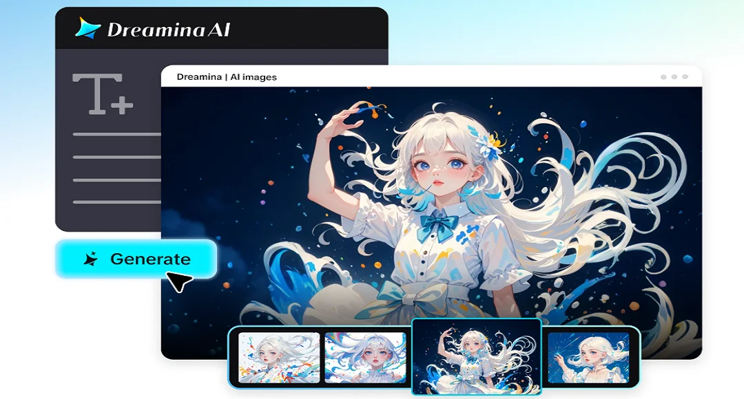
Open Dreamina, click “AI Image”, and describe the image you want to produce.
Example prompt: Design a vertical technology-fashion poster with the title “GRAVITY OFF” in large, bold, edited-style lettering, a liquid-metal sneaker with a spiral heel at the center, a cobalt blue and coral orange color scheme, and three short lines of small print at the bottom, clean and readable.
Step 2: Choose a model, settings, and generate
Choose “Image 5.5 by Seedream 5.5” and adjust the image settings to match your needs, such as aspect ratio, resolution, and number of outputs. Once done, click “Generate” to build the poster.
Step 3: Refine and export
Fine-tune your specific areas by adjusting colors, shapes, text, or other visual details through follow-up edits. Once the poster looks right, check the final layout and text for accuracy, then click “Download” to save the generated poster image.
Plan the layout before the details
The prompt guide behind Seedream 5.5 gives a useful rule: set the overall framework first, then the details. Say what kind of image it is, how the layout is divided, and where each element goes.
For a poster, you might describe a title zone, a hero image zone, and a small print zone. Once the model understands the structure, details like fonts and colors have a clear place to land. This works for both vertical and horizontal frames.
Write copy that travels between formats
Short copy adapts best. A strong title, one tagline, and a few lines of small print can rearrange easily across frames.
Keep the same wording for every version, and let the layout change. If a horizontal frame has room for a longer line, resist the urge to change the message. Consistent wording makes your campaign feel unified, and it lets you check text accuracy once instead of several times.
Typography instructions that keep text accurate
The manual’s prompt guide recommends putting text in quotation marks and describing the font, weight, color, alignment, and number of lines. For example, say the title is bold, white, centered, and on one line.
When changing a word, be precise about which word on which line should change, and state that the layout, line spacing, and background stay the same. These details help Seedream 5.5 render the right words in the right places.
Keeping colors and style consistent across frames
A campaign looks professional when every frame shares a palette. Name your colors in the prompt, such as cobalt blue and coral orange, and repeat them for each version.
Also repeat the key visual, such as the sneaker. If one version drifts, use a follow-up edit to restore the color or the style. A consistent look across vertical, horizontal, and square formats strengthens recognition.
Reviewing small print with care
Small text deserves a careful check. The manual lists small print accuracy at 95% as a capability, but it also notes that the 95% figure has not been tested in these demos and that font details still need formal output review.
Treat that as a practical reminder. Zoom in, read every line, and compare it against your intended copy. Fix any mistakes with a targeted text edit before you publish.
Final thoughts
Designing vertical and horizontal posters from the same copy is easier when the layout adapts instead of stretching. With Dreamina’s Seedream 5.5, you can plan one message, set the structure, and generate versions for different frames, each with its own balanced composition.
Concepts like GRAVITY OFF, MAKE SOME NOISE, and AFTER HOURS show how style and typography can carry across formats.
Read More: Susbluezilla New Software: Features, Safety & How to Fix Errors